VCL weld: create LibreOffice GUI from design files

LibreOffice uses VCL (Visual Class Library) as its internal widget toolkit to create the graphical user interface (GUI) of LibreOffice. Here I discuss how to use UI files designed with Glade interface designer to create LibreOffice user interfaces with a framework called weld, which is part of LibreOffice core source code.

Creating a Minimal VCL Weld Application

In my previous blog post, you can find out about the structure of a minimal VCL application. Please refer to the below blog post to see how a Window is created in VCL, and how it can be used as a test workbench called minvcl. You can run it with ./bin/run minvcl after you build LibreOffice.

VCL application in its minimal form

Here I discuss how to go further, and create user interface with Glade interface designer, and do most of the things without writing code.

VCL Weld Mechanism

In order to simplify user interface creation in LibreOffice, experienced LibreOffice developer, Caolán, has introduced a mechanism to load UI files created with Glade interface designer, and use them as if they are UI files for each and every GUI framework that LibreOffice supports: from GTK itself to Qt, Windows, macOS and even the so-called gen backend that only requires the X11 library on Linux.

To illustrate how the VCL weld mechanism works, I have added a minimal example, minweld, as a test workbench. The structure of the code is very similar to the previous example, minvcl, but there are some changes in the code. In the new code, UI is created from a .ui file that is designed visually with Glade interface designer. The .ui file is an XML file which contains placement of widgets that should be displayed on the screen.

The complete code for minweld is available in the LibreOffice core source code repository, which can also be viewed online:

Glade UI File

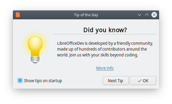
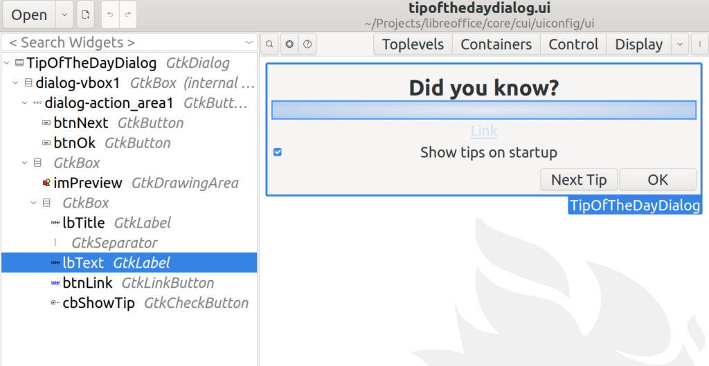
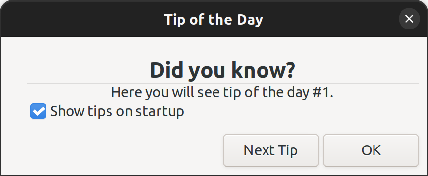
In minweld, I have used an existing Glade UI file, tipofthedaydialog.ui. This is the user interface for displaying a tip of the day in LibreOffice at startup. Heiko, the TDF design mentor, has discussed this dialog box in detail before:

Easyhacking: How to create a new “Tip-Of-The-Day” dialog

But, you can assume that it is a simple .ui file, that one can create with Glade. Here, we use it to create our own user interface in C++. You may use any other .ui file that you have created with almost the same code.

Tip of the day displayed at LibreOffice startup

This UI file is found in cui/uiconfig/ui/tipofthedaydialog.ui, and minweld loads it. This is how it looks when you open it in Glade interface designer:

tipofthedaydialog.ui in Glade user interface designer

Let’s look into the specifics of minweld.cxx.

Header Includes

Headers are almost the same, but here we use vcl/weld.hxx instead of vcl/wrkwin.hxx. Therefore, you can see this line in the code:

#include <vcl/weld.hxx>

Then we have the C++ code for the application. The TipOfTheDayDialog class is defined with:

class TipOfTheDayDialog : public weld::GenericDialogController
{
public:
    TipOfTheDayDialog(weld::Window* pParent = nullptr);
    DECL_LINK(OnNextClick, weld::Button&, void);

private:
    std::unique_ptr<weld::Label> m_pTextLabel;
    std::unique_ptr<weld::Button> m_pNextButton;
    sal_Int32 m_nCounter = 0;
};
...
}

As you can see, TipOfTheDayDialog inherits from weld::GenericDialogController, and not Application class as before. Also, TipOfTheDayDialog constructor receives a parent of type weld::Window*, which is nullptr now. The reason is that there is no parent window in this example. Using weld:: prefix is also done for other types of widgets that we use in LibreOffice. For example, we use weld::Button to denote a push button in LibreOffice, or in any application that is created with the vcl::weld mechanism.

Class Constructor

This is the code for the TipOfTheDayDialog constructor. Here, we initialize two member variables, m_pTextLabel and m_pNextButton which point to a label and a button, respectively. We will interact with these two in our code. There are string literals like lbText and btnNext , which are the IDs of those widgets in Glade. The IDs should be unique for linking to specific variables in the code.

TipOfTheDayDialog::TipOfTheDayDialog(weld::Window* pParent)
: weld::GenericDialogController(pParent, u"cui/ui/tipofthedaydialog.ui"_ustr,
u"TipOfTheDayDialog"_ustr)
, m_pTextLabel(m_xBuilder->weld_label(u"lbText"_ustr))
, m_pNextButton(m_xBuilder->weld_button(u"btnNext"_ustr))
{
    m_pNextButton->connect_clicked(LINK(this, TipOfTheDayDialog, OnNextClick));
}

One last step is linking the events with functions in the code. You may do that with the LINK macro. In the last line, connect_clicked activates OnNextClick from the class TipOfTheDayDialog, whenever m_pNextButton is clicked.

Event Handler

This is the implementation of the event handler. It should be started with IMPL_LINK macro, in the form of IMPL_LINK_NOARG(Class, Member, ArgType, RetType). The code is straightforward: It increases a counter which is initially zero, and displays it alongside a text:

IMPL_LINK_NOARG(TipOfTheDayDialog, OnNextClick, weld::Button&, void)
{
    ++m_nCounter;
    m_pTextLabel->set_label(u"Here you will see tip of the day #"_ustr
+ OUString::number(m_nCounter) + ".");
}

With a call to set_label function, m_pTextLabel is updated every time that you click on “Next Tip” button.

Running the Example

You may run the example after you have built LibreOffice from sources. Then, you may simply invoke:

./bin/run minweld

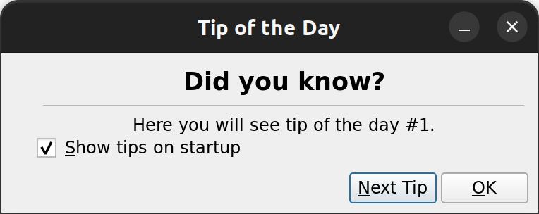
The result is a little bit different from the tipoftheday dialog in LibreOffice, as it does not use a picture. But, it has a nice feature: if you click on “Next Tip”, it will show a text and a counter that goes up whenever you click on it again.

Final Notes

You may look into the original “tip of the day” dialog box in cui/source/dialogs/tipofthedaydlg.cxx, which is more complex than the one that we created here, as it reads some data from the configuration and uses images. But, the idea is the same. Inherit a class from GenericDialogController, define and link variables to the widgets with their IDs, add event handlers. Now, the application with VCL graphical user interface is ready to use!

This is somehow similar to the way one creates dialog boxes with Qt and other widget toolkits. On the other hand, the VCL weld mechanism is different in the way that it uses such a toolkit to create UI on the fly. Therefore, if you choose a desired VCL UI plugin, then it will use that specific library for creating user interface. For example, you can run minweld example with Qt this way:

export SAL_USE_VCLPLUGIN=qt5

./bin/run minweld
The minweld example in Qt (light theme)

You may also run it with GTK3 UI, this way:

export SAL_USE_VCLPLUGIN=gtk3

export GTK_THEME=Adwaita:light # For light/dark theme

./bin/run minweld
The minweld example in GTK3 (light theme)

I hope that this explanation was helpful for you to understand the basics of GUI design and implementation in LibreOffice. You can try doing small improvements in LibreOffice GUI by looking into the EasyHacks that with the tag “Design“:

TDF Wiki: EasyHacks categorized by “Design” as the required skill

We welcome your code submissions to improve LibreOffice. If you would like to start contributing to LibreOffice, please take a look at our video tutorial:

Getting Started (Video Tutorial)

Read the rest

Read More

Notebookbar part 1: custom widgets for the tabbed interface

Notebookbar, or tabbed interface is an attempt to modernize LibreOffice user interface. In these series, I try to explain the implementation in LibreOffice code. In the first part, I discuss custom Glade widgets that are building blocks of Notebookbar user interface.

Building LibreOffice From Sources

If you haven’t built LibreOffice from sources before, you can refer to can refer to this tutorial:

Getting Started (Video Tutorial)

The next sections assume that you have a working build environment.

Custom Widgets in Glade Catalogs

Notebookbar implementation consists of .ui files, configuration files and C++ implementation. Let’s look into the user interface files.

First time that you clone LibreOffice source code, and try to open a Notebookbar UI file like this, you may see error:

$ glade ./sc/uiconfig/scalc/ui/notebookbar.ui

You may see an error, which indicates that a required catalog related to LibreOffice is not available.

Glade error
Glade error

To fix this issue, you have to know that Notebookbar uses custom widgets that with the Glade interface designer. These custom widgets are available from a Glade catalog with the name of LibreOffice.

Inside sc/uiconfig/scalc/ui/notebookbar.ui, you may see these two lines:

<requires lib="gtk+" version="3.20"/>
<requires lib="LibreOffice" version="1.0"/>

Glade catalogs are xml files with the keyword glade-catalog inside them, so we can search for this keyword:

$ git grep -l glade-catalog
extras/source/glade/libreoffice-catalog.xml.in
extras/source/glade/makewidgetgroup.xslt

The .in files is an input file in which the build process creates the final xml file out of it. Searching for glade-catalog inside the build folder results:

$ grep -lr glade-catalog
...
instdir/share/glade/libreoffice-catalog.xml

As you can see, the result goes inside the folder instdir/share/glade/, so to be able to use the catalog, you should add this folder to the glade catalog search path. One of the easiest ways to do this, is to add it via Glade interface itself. Use ☰ (hamburger menu), go to “Glade Preferences”, and add instdir/share/glade/ to the “Extra Catalog & Template paths”. Then, reload a notebookbar UI file, and the error should go away. This setting is saved inside ~/.config/glade.conf configuration file.

If you want to get a preview of the UI file, you need to set the environment variable first:

$ export GLADE_CATALOG_SEARCH_PATH=$PWD/instdir/share/glade
$ glade-previewer -f sw/uiconfig/swriter/ui/notebookbar.ui

Custom Widgets for the Notebookbar

Inside the Glade custom catalog instdir/share/glade/libreoffice-catalog.xml, you can see 10 custom widgets:

$ grep "glade-widget-class\ " instdir/share/glade/libreoffice-catalog.xml
<glade-widget-class title="Notebookbar ToolBox" name="sfxlo-NotebookbarToolBox" generic-name="Notebookbar ToolBox" parent="GtkToolbar" icon-name="widget-gtk-toolbar">
<glade-widget-class title="Notebook switching tabs depending on context" name="sfxlo-NotebookbarTabControl" generic-name="NotebookbarTabControl" parent="GtkNotebook" icon-name="widget-gtk-notebook"/>
<glade-widget-class title="Horizontal box hiding children depending on its priorities" name="sfxlo-PriorityHBox" generic-name="PriorityHBox" parent="GtkBox" icon-name="widget-gtk-box"/>
<glade-widget-class title="Horizontal box hiding children depending on its priorities" name="sfxlo-PriorityMergedHBox" generic-name="PriorityMergedHBox" parent="GtkBox" icon-name="widget-gtk-box"/>
<glade-widget-class title="Box which can move own content to the popup" name="sfxlo-DropdownBox" generic-name="DropdownBox" parent="GtkBox" icon-name="widget-gtk-box"/>
<glade-widget-class title="Box which can hide own content" name="VclOptionalBox" generic-name="VclOptionalBox" parent="GtkBox" icon-name="widget-gtk-box"/>
<glade-widget-class title="Vertical box hiding children depending on context" name="sfxlo-ContextVBox" generic-name="ContextVBox" parent="GtkBox" icon-name="widget-gtk-box"/>
<glade-widget-class title="Managed Menu Button" name="svtlo-ManagedMenuButton" generic-name="ManagedMenuButton" parent="GtkButton" icon-name="widget-gtk-button"/>
<glade-widget-class title="NotebookBar Toolbar Addons" name="NotebookBarAddonsToolMergePoint" generic-name="ShowText" parent="GtkToolButton" icon-name="widget-gtk-toolbutton"/>
<glade-widget-class title="NotebookBar MenuItem Addons" name="NotebookBarAddonsMenuMergePoint" generic-name="ShowText" parent="GtkMenuItem" icon-name="widget-gtk-menuitem"/>

The previous xml shows the custom widgets that are building blocks of building Notebookbar. Let’s look into each of them, based on their title and names.

Notebookbar widgets

In the next picture, you can see the notebookbar in LibreOffice, and compare it to what is visible in Glade user interface designer. As you can see, not everything is visible in the designer. Specifically, icons and text are not visible in the designer but are visible in the final application.


LibreOffice with Notebookbar
Notebookbar in LibreOffice

Main Widget

1. Notebookbar Tab Control: This widget has the name sfxlo-NotebookbarTabControl, and is the primary widget for Notebookbar. It can change the set of visible tabs based on the user context. Its parent class is GtkNotebook and provides context-sensitive tab switching.

Container Widgets

2. NotebookbarToolBox: This widget is named sfxlo-NotebookbarToolBox,  its parent class is GtkToolbar. It can contain toolbar elements.

NotebookbarTabControl

3. Priority Horizontal Box: This widget has the name sfxlo-PriorityHBox, and its parent class is GtkBox. It is the horizontal box hiding children depending on its priorities. In this way, lower priority widgets becomes hidden to give the more important widgets room to be displayed on a screen that is not big enough to show all the available elements.

4. Priority Merged Horizontal Box: This widget has the name sfxlo-PriorityMergedHBox, and its parent class is GtkBox. It is the “horizontal box hiding children depending on its priorities”. This widget is also related to the previous one for creating more room for important widgets, but it is used inside the PriorityHBox.

5. Optional Box: This widget has the name VclOptionalBox, and its parent class is GtkBox. This “box which can hide own content”, is a widget that is useful for creating small areas dedicated to a specific purpose. For example, you may see Home-Section-Clipboard, which is used to define an area for clipboard related tasks inside Home tab.

6. Contextual Vertical Box: This widget has the name sfxlo-ContextVBox and is a “vertical box hiding children depending on context” and its parent class is GtkBox. It provides a box that can act based on the context, showing and hiding its children accordingly. You may look into sw/uiconfig/swriter/ui/notebookbar_single.ui, which provides an example use.

Here is the correct control hierarchy, as depicted and described in the TDF Wiki:

Correct Notebookbar controls hierarchy

Menu Widgets

7. Dropdown Box: This widget has the name sfxlo-DropdownBox, its parent class is GtkBox and is a “box which can move own content to the popup”. This is also useful where the space for the tabbed interface is not big enough. The menu, is what you can see in “File” and “Help” menu in every notebookbar in LibreOffice tabbed interface. Please note that only 1 GtkBox child should be inside it, so that the popup works properly. In fact, the above diagram shows the correct usage.

8. Managed Menu Button: This widget has the name svtlo-ManagedMenuButton, and its parent class is GtkButton. It is a “Managed Menu Button”. It provides a button that opens a dynamic menu which is populated according to the context.

Custom Widgets for the Extensions

9. NotebookBar MenuItem Addons: This widget has the name NotebookBarAddonsToolMergePoint, and its parent class is GtkToolButton. Specifically, LibreOffice extensions can use it for adding additional tools to the notebookbar.

10. NotebookBar MenuItem Addons: This widget has the name NotebookBarAddonsMenuMergePoint, and its parent class is GtkMenuItem. This is also used for adding extra items into the notebookbar.

Final Notes

You can find useful information about Notebookbar in the design team blog:

And at last, these are some useful Wiki articles around Notebookbar in the TDF Wiki:

Read the rest

Read More